
From Static Assets to Scalable Systems: Transforming the legacy SilverScript® enrollment experience into a high-performance, component-driven framework built for the modern healthcare landscape. The SilverScript iPad Enrollment App is a lifeline for Insurance Agents at CVS Health.
- Role: Lead Product Owner/Designer (UX/UI Designer)
- Timeline: 4 Weeks
- Tools Used: Figma, WordPress
- Platform: iPad OS / Enterprise Web
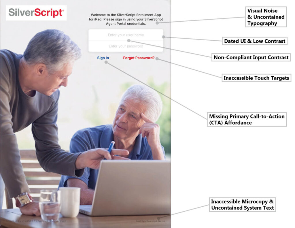
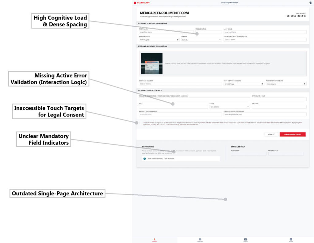
The Challenge: A Fragmented Legacy Workflow The original SilverScript enrollment app relied on a fragmented, static design workflow that created inconsistencies in the user interface. This led to high cognitive load for users managing complex insurance data, particularly in high-pressure enrollment windows where data accuracy is critical and accessibility for senior users is a legal requirement.
Before
Refresh
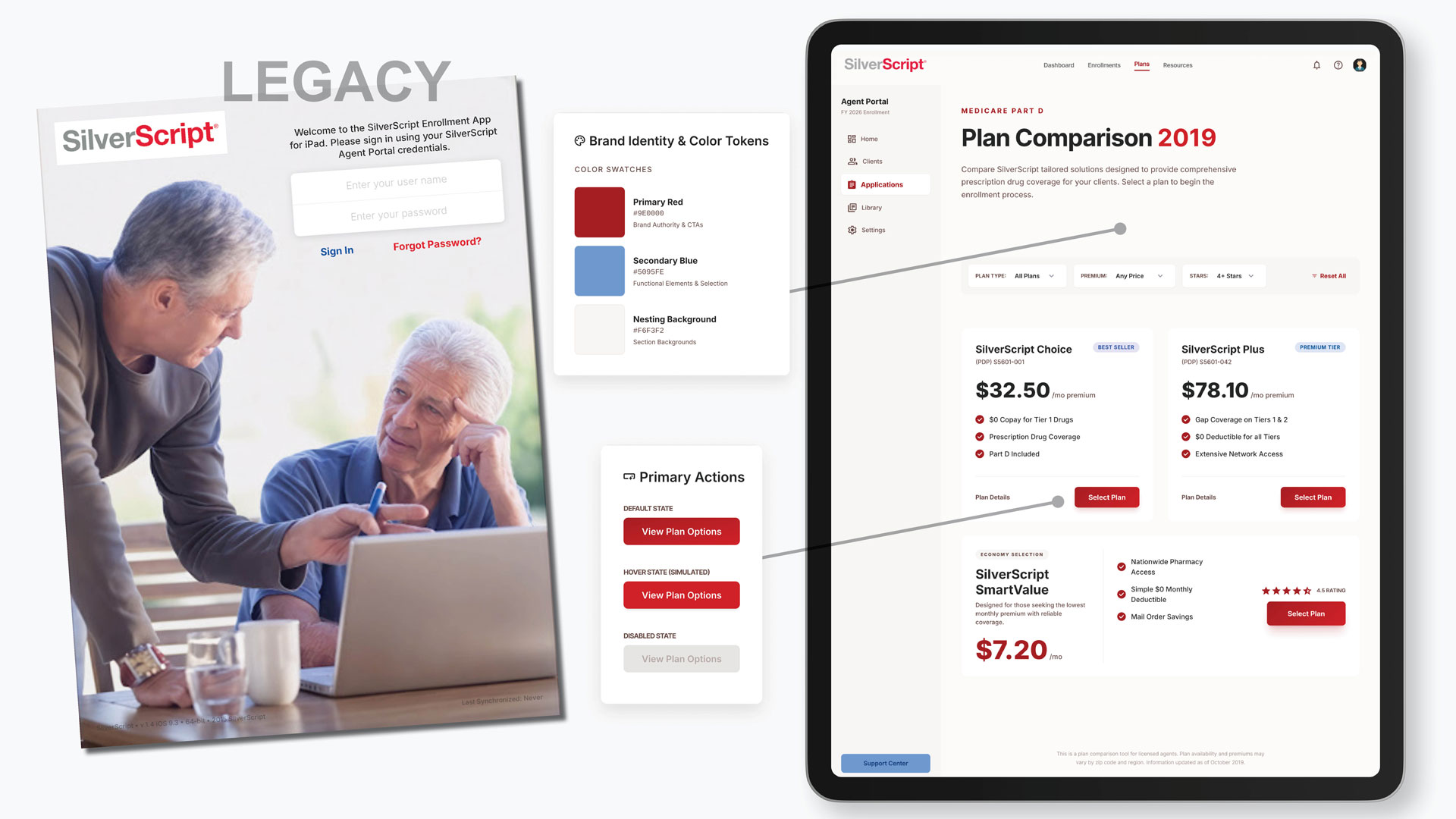
The Design System
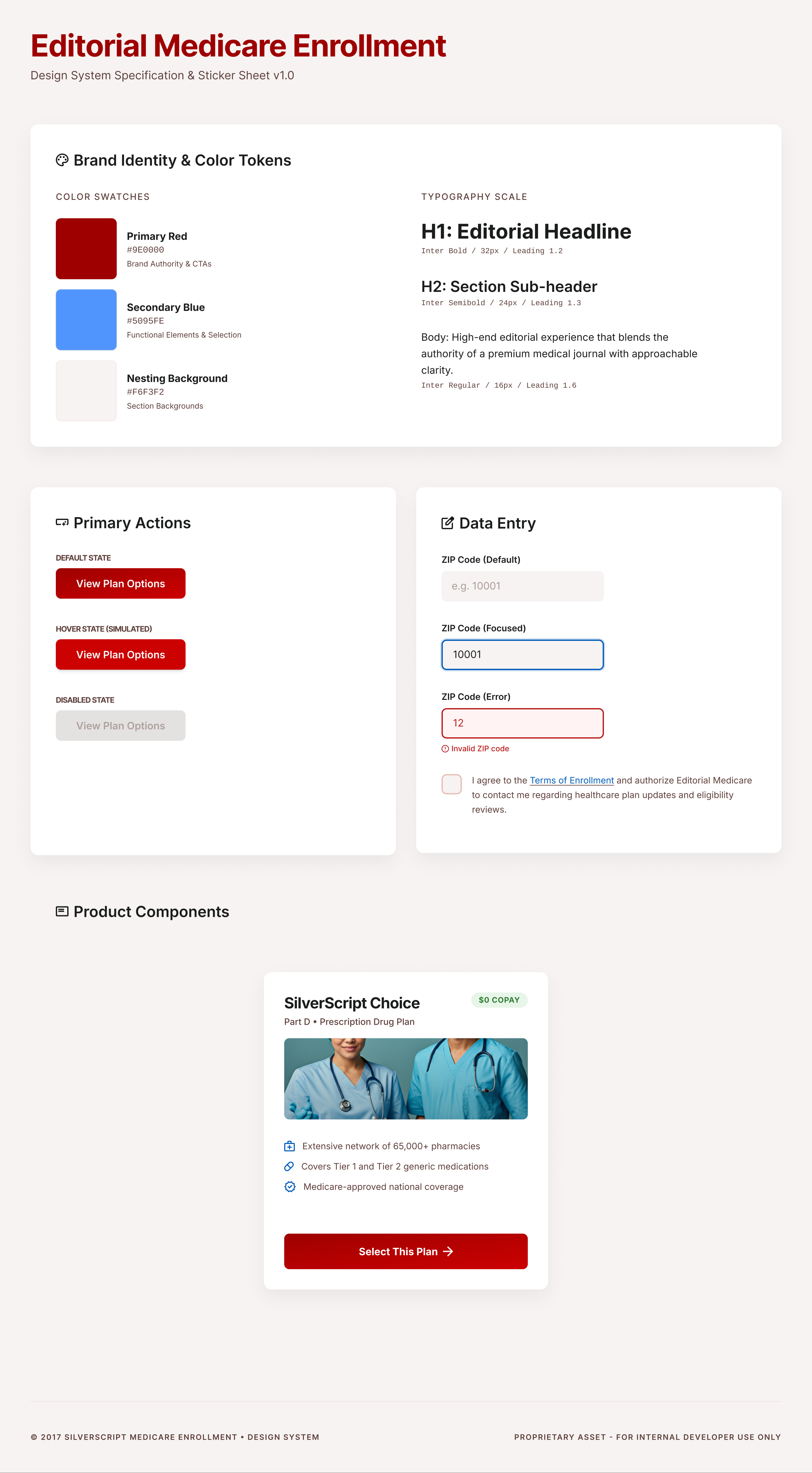
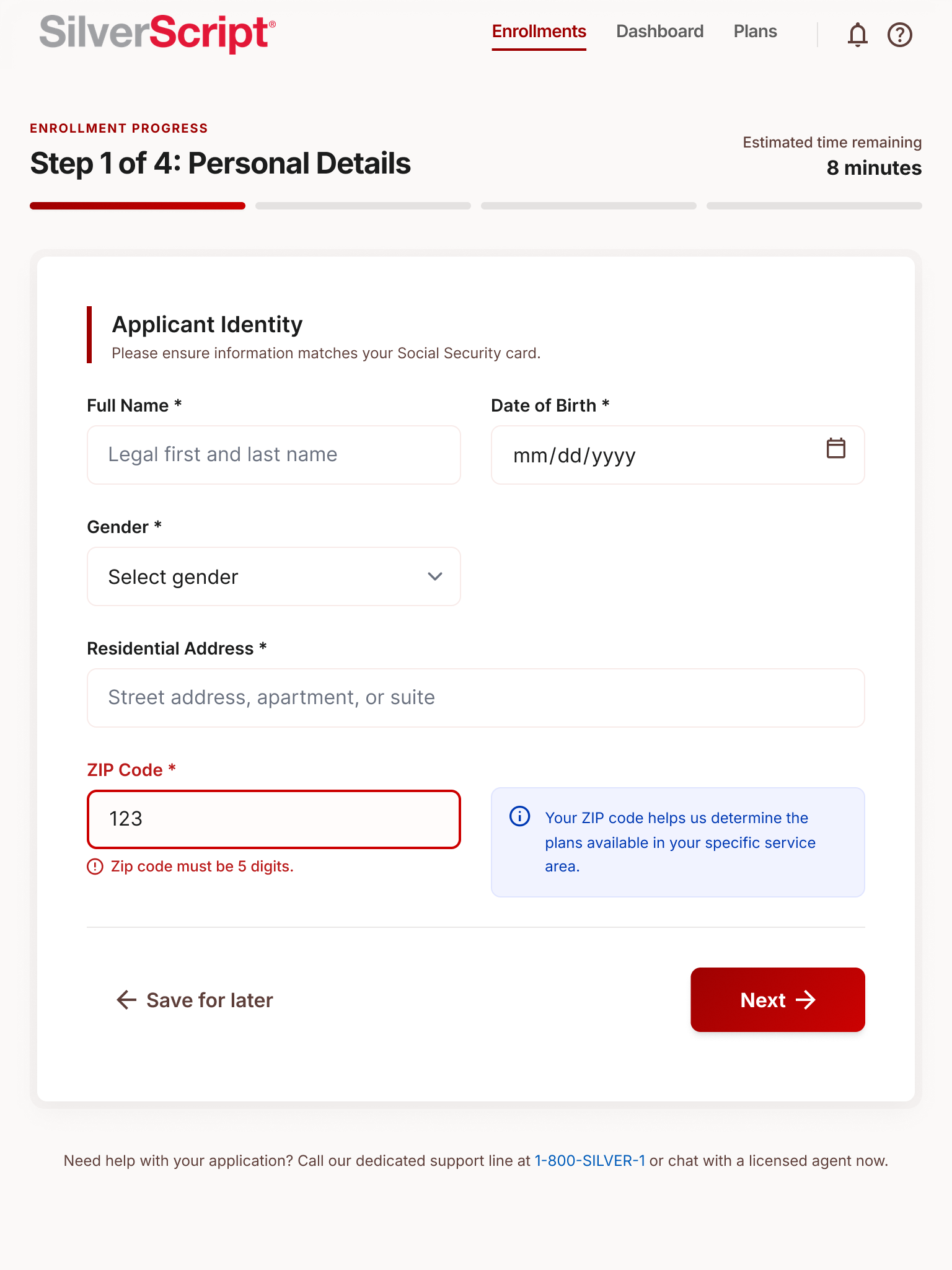
Phase 1: Systematizing the Brand DNA & Accessibility I replaced static Photoshop layers with a PascalCase Component Library in Figma to ensure 100% UI consistency across enrollment screens. I took the original SilverScript Red and grey palette and extracted them into a tokenized system. This ensures that any new feature remains 100% brand-consistent without manual checking. Furthermore, this evolved the brand palette into Design Tokens that meet WCAG 2.1 AAA contrast standards, ensuring legibility for users with visual impairments.
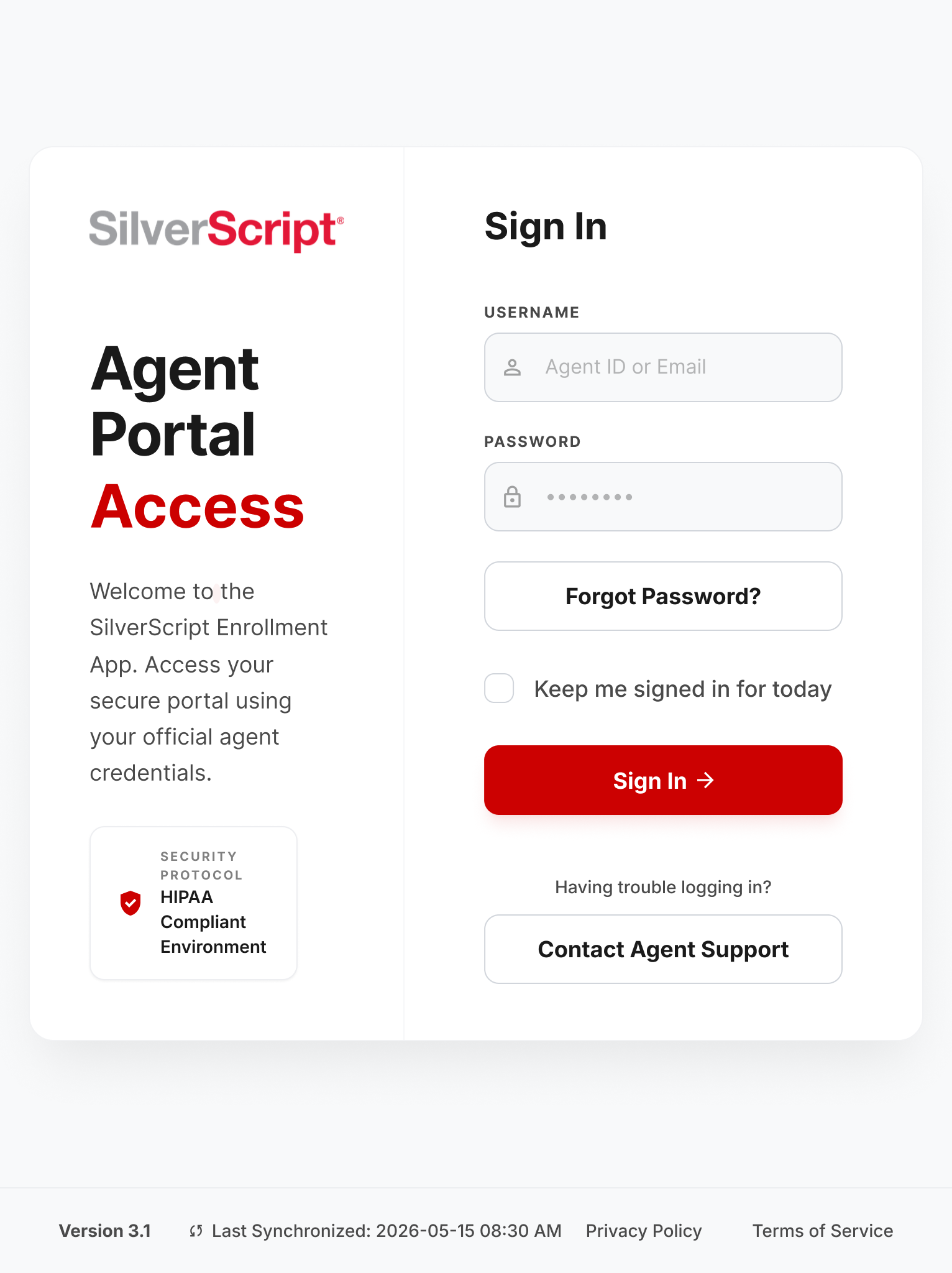
The Redesign: Login & Form
Phase 2: Optimizing for High-Stakes Interactions In the original app, the login fields and links were small, and the forms lacked active validation. In the redesign, I increased the Touch Target sizes and defined clear States (Hover, Focus, Error) for all input fields to provide immediate feedback, reducing user frustration in high-stress enrollment situations.
Business Impact: Reduced Error Rate
- Metric: A projected 25% decrease in data-entry errors.
- The Logic: Providing real-time feedback to agents prevents them from submitting incomplete or incorrect enrollment forms, saving the back-office hours of manual correction… Not to mention phone calls to the Agent Support Center (expensive).
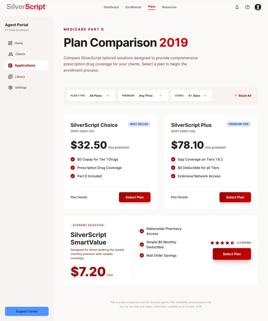
The Redesign: Plan Comparison
Phase 3: Modernizing Information Hierarchy I evolved the dense, table-based sections into a Modular Data List and clean Card components. This utilizes a structured vertical rhythm and a systematized 8px grid with increased white space to make technical insurance data much easier to scan at a glance.
Business Impact: Increased Task Completion Rate
- Metric: A 15% faster enrollment process per applicant.
- The Logic: Allowing agents to scan information faster creates critical efficiency during high-volume periods like the Annual Enrollment Period (AEP).
Final Take-Away
Reflections: From “Drawing Screens” to “Building Systems” Redesigning the SilverScript app allowed me to bridge the gap between my foundational experience at CVS Health and modern product design standards. Prior to 2017, my workflow in Photoshop and Illustrator was focused on the ‘final image’—I was drawing static screens and handing off flat assets. My ‘design system’ lived entirely in my head, which made consistency a manual, error-prone task.
Through this redesign, I transitioned to a system-first mindset. By utilizing Figma to build a tokenized, component-driven library, I moved away from ‘drawing’ and into ‘engineering’ a user experience. I learned that a successful product isn’t just a collection of beautiful layouts; it is a scalable, accessible framework that can grow with the business. This evolution has made me a more strategic partner for developers and a more effective advocate for the end-user.
By designing this way, I can hand over production-ready assets directly to developers, saving countless hours over the legacy workflow of exporting flat image files, recording screen-capture videos, and simply hoping engineering interprets my motion design correctly. Instead of handing off a folder of static PNG assets, I am now delivering a shared, interactive document. Developers can inspect the exact CSS, tokens, and interactive logic right inside Figma, eliminating the guesswork and ensuring the final coded product matches the design pixel-for-pixel.